Twin Spirits Distillery
The
Challenge
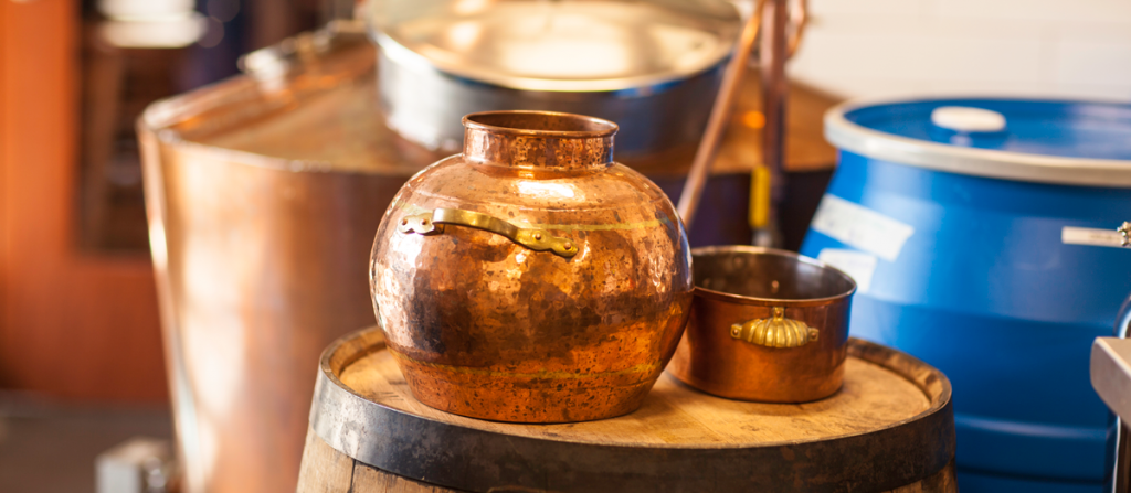
Craft distillers began bubbling up in the Twin Cities following new laws in the state that provided for craft distilleries to have cocktail rooms. It was a game-changer.
Twin Spirits was one of the originals and the first all woman-owned distillery in the state. To help take their place in the craft distillery world, Twin Spirits needed a brand that made them stand out from the other new distilleries. Our challenge was to create a brand that could stay true to its founder and also own its place in the market.
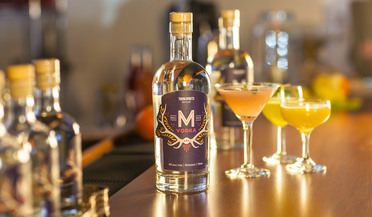
The cocktail room has a view to the distillery.
Our
Approach
We knew from the outset that the brand was going to genuinely reflect the spirit of the founder, the incredible Michelle Winchester. She had a vision for the brand that was a driving force and an idea that customers would come to know and love. The goal was to make a splash in the market while allowing a spiritual notion to have a seat at the table. We chose an approach that could be translated not only into a brand identity, but the all-important packaging that would be how the brand lived on shelves.
Our goal was to make the founder’s vision a reality.
Branding
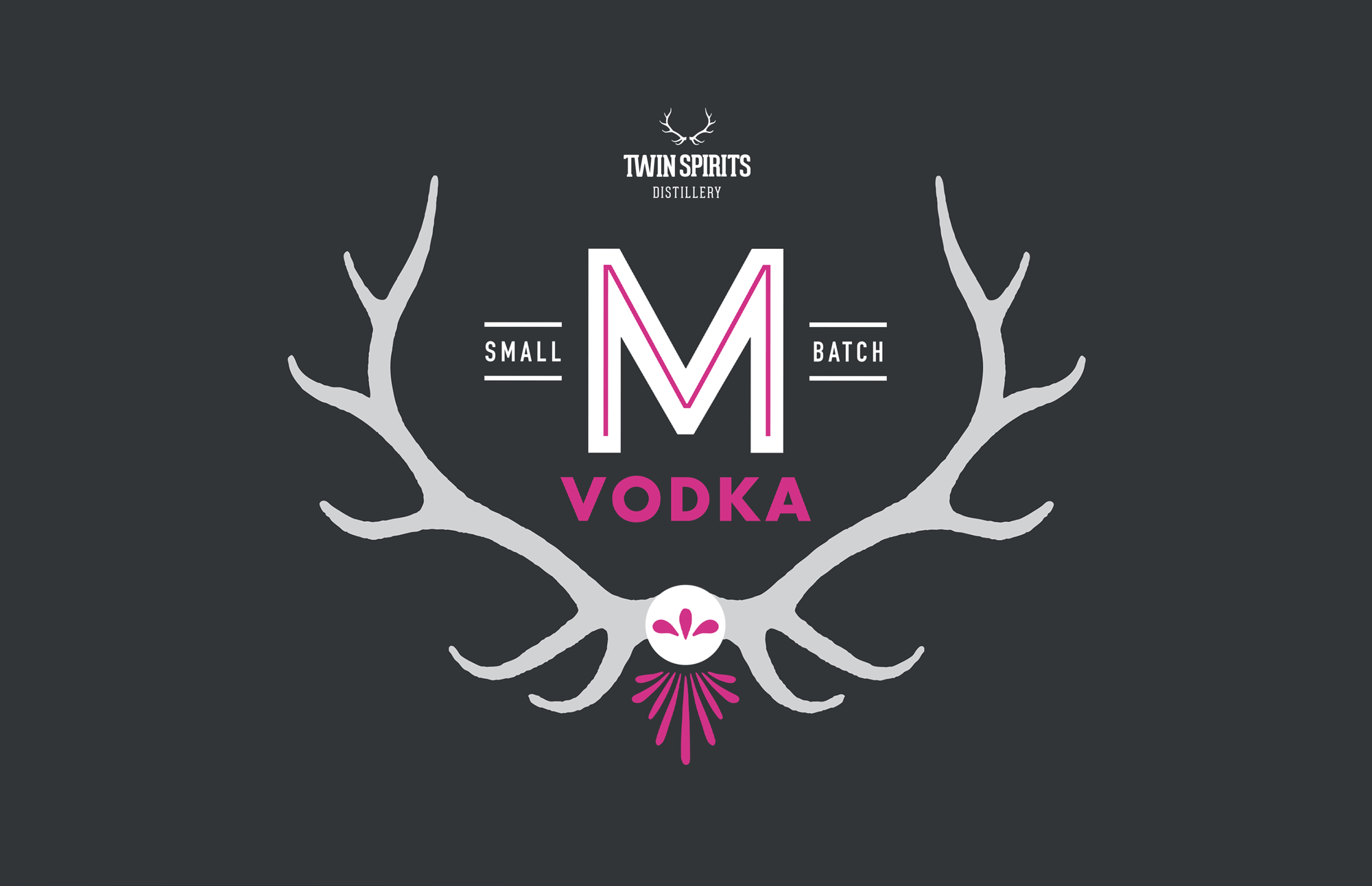
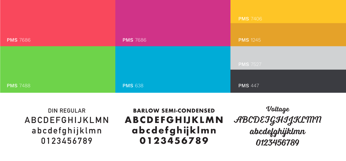
Our exploration led us to horn imagery and a logotype approach that evokes lighthearted joy, into which we worked handmade character and natural elements that reflect the authentic craft-made distilling that’s done at Twin Spirits. We created a storied system around it that feels friendly yet mysterious and nature-rich, adding depth and vibrancy with symbols that blend the “twin” vision with a mirrored illusion.
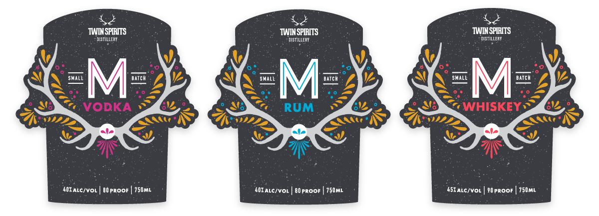
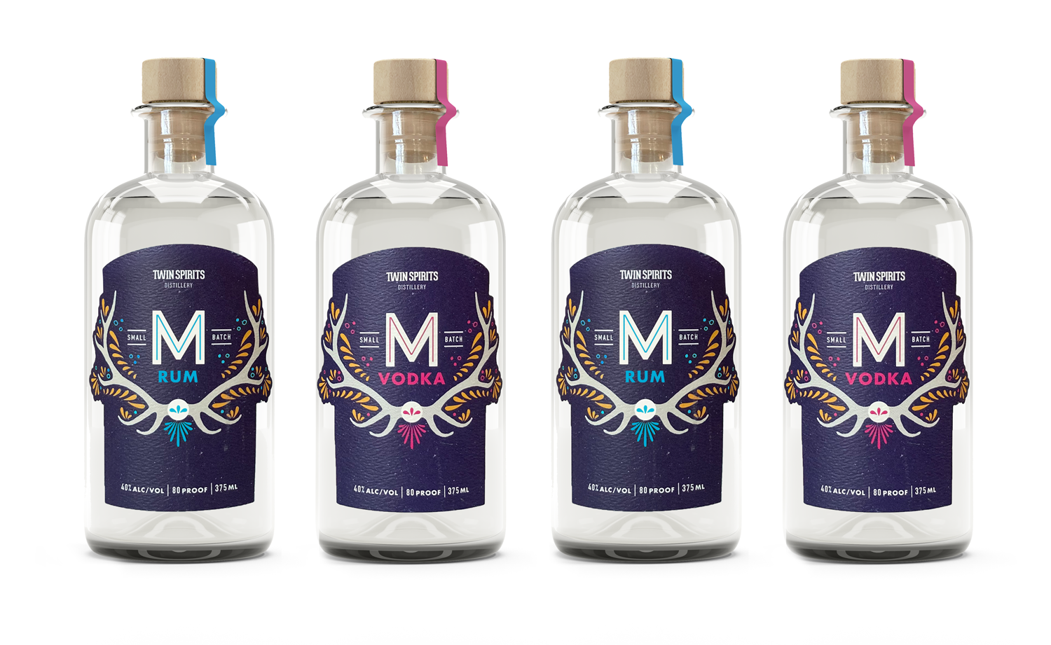
Packaging
We also created packaging—labels and bottle sourcing—to reinforce the warm and natural narrative. We infused the design with vibrant colors that reflect the different distilled products and hand-drawn flourishes. The line of spirits is easy to spot in the stores, and flexible for updating their ever-growing line of spirits.